Back to WORK
RESSENCE
ESSENTIAL QUEST
Reinforcing the expression of an essentialist watchmaking brand
-
BackgroundFounded by industrial designer Benoît Mintiens in 2010, Ressence set out with a bold mission: to rethink the mechanical watch from the ground up, starting with the user’s experience. Over 15 years of relentless exploration, Ressence has simplified complex engineering through intuitive design, creating watches that don't just tell time, they redefine how we perceive and experience it.
Challenge
As the brand evolved, so did its need for a clearer narrative, stronger visual cohesion, and a more expressive way to articulate its identity across touchpoints. With the arrival of Brand Director Simon Hadjidimoff, Ressence entered a new phase of brand reinforcement, beginning with the definition of its foundations, visual identity, and formal language. During this strategic evolution, he entrusted us with the task of bringing greater coherence to the brand’s communication ecosystem.
Strategic Idea
Through workshops, research, and editorial development, we explored Ressence not simply as a watch company, but as an expression of essentialism. At the centre of this reflection sat a belief that innovation can create greater clarity, presence, and room for what matters. Less noise. More attention. More meaningful interactions with objects, people, ideas, and the world around us. This perspective brought new coherence to the brand’s expressions. The name Ressence itself, a contraction of “renaissance” and “essence”, became a valuable lens through which to interpret the brand. Ideas of renewal, springtime, lightness, clarity, and quiet sophistication informed the development of visual, editorial, and communication systems.
Our ApproachIn collaboration with the Brand Director, we refined the brand’s values and personas, and co-developed internal lifestyle photoshoot guidelines and the “Ressence Man” visual identity, detailing tones, textures, and cuts for future productions. We authored a tone of voice guide built around four principles, with signature phrases, lexicon, linguistic tools, and guidelines for both human teams and AI models. In parallel, we supported product launches and editorial initiatives through art direction and narrative work. We introduced the practice of product teasers and co-directed five watch launch campaigns. We contributed to Ressence’s editorial output by authoring “Arts & Crafts in Motion”, contributing to the text-led “Bold Statements” campaign, shaping a more narrative approach to press releases, editing the 2023 and 2025 Catalogues Raisonnés, and shaping interviews for Meaningful Encounters, including those with architect Daniel Libeskind and artist Shantell Martin.
SCOPE OF WORK
Brand Strategy, Communication, Creative/Art Direction, Copywriting
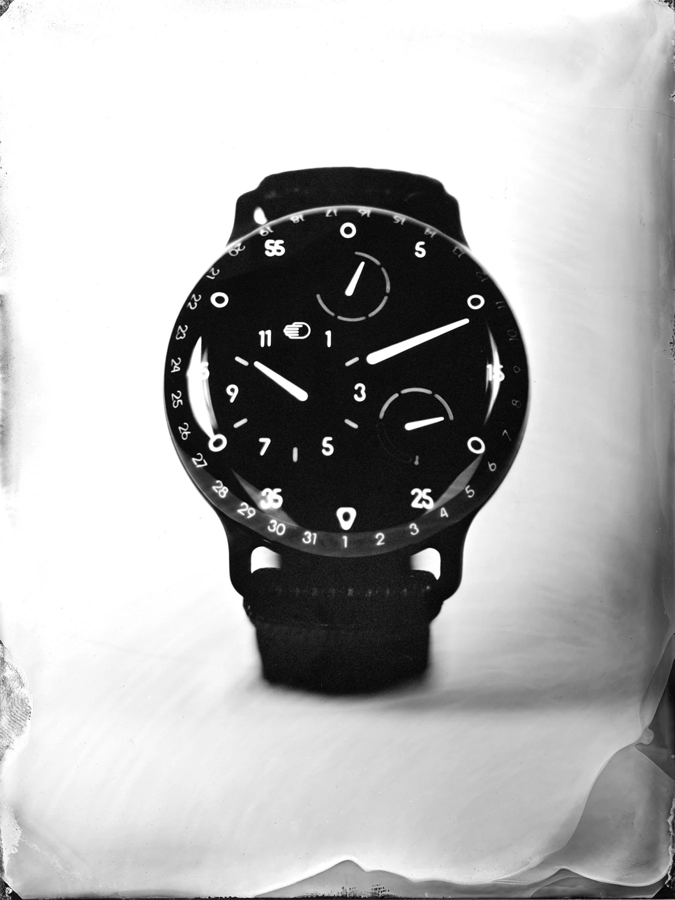
TYPE 3 BB2 — TEASER & REVEAL
Time magic through liquid precision
You just heard the click. Time to hurry. Pour water in the tank. Drop the collodion plate in. Wait a few seconds. Anticipation fills the room. The air is thick with the scent of chemicals. And here it comes, the moment of truth. The first photo of the new TYPE 3 BB2 is revealed to you.
CREDITS
Creative Direction: Vaya Sigmas & Simon Hadjidimoff
Creative Partner: Studio Baxton
Photography: Marjolaine Vuarnesson
Videography: Claude Lee Sadik
© Ressence 2024
© STUDIO BAXTON
TYPE 1° M — TEASER
For the colourful mind
-
When graphic arts inspire a watch. A silkscreen interpretation of the TYPE 1°M, offered to the first fifty owners.CREDITS
Creative Direction: Simon Hadjidimoff
Art Direction: Vaya Sigmas
Silkscreen: Gregory Huwart / Gezeever
Motion Design: Gringo’s Design
Videography: Claude Lee SadikLimited to 50 numbered copies
© Ressence 2023
© GRINGO'S DESIGN
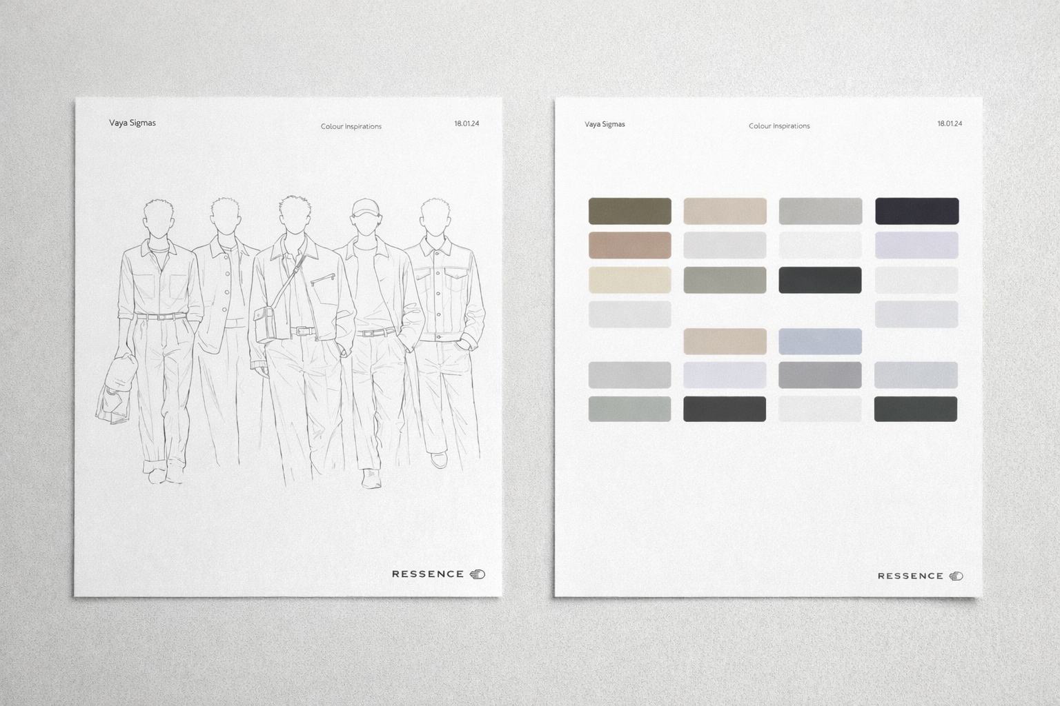
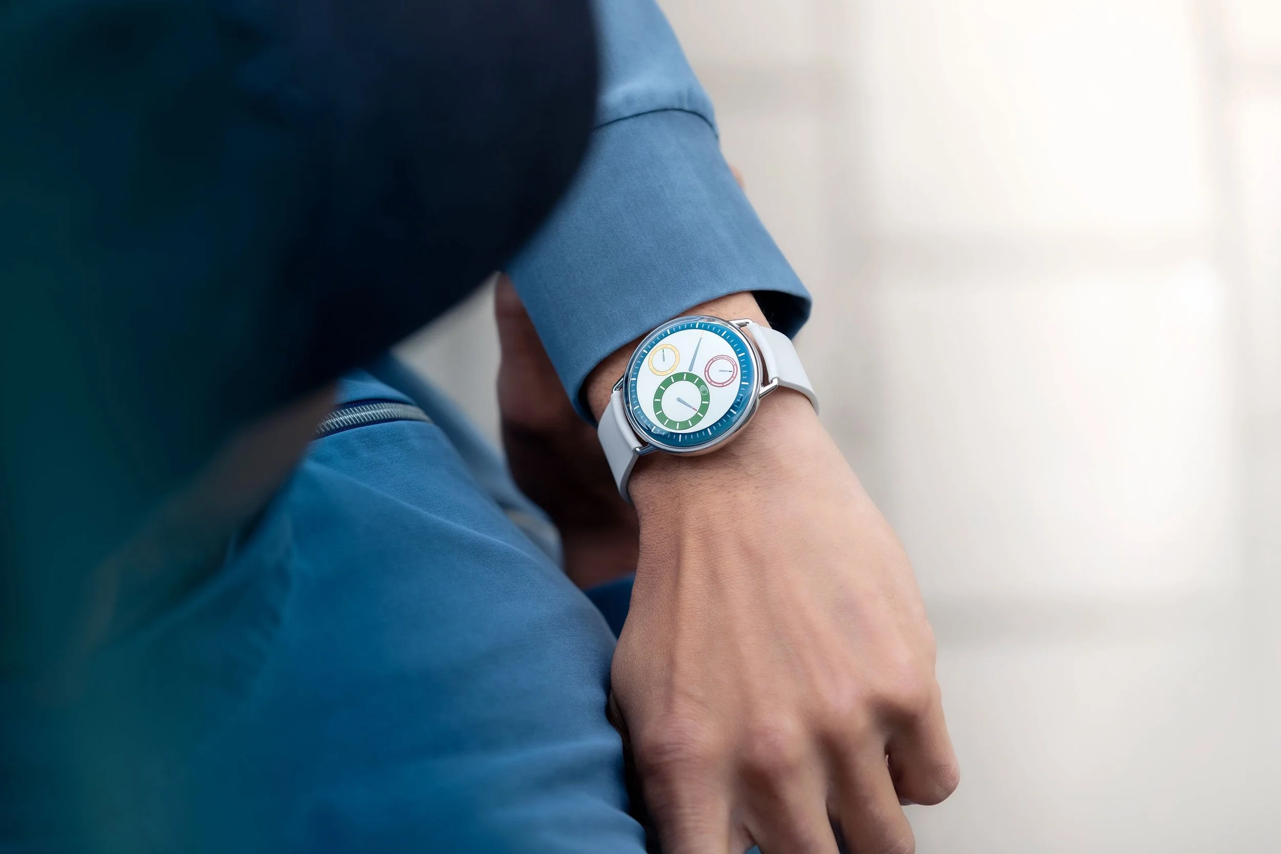
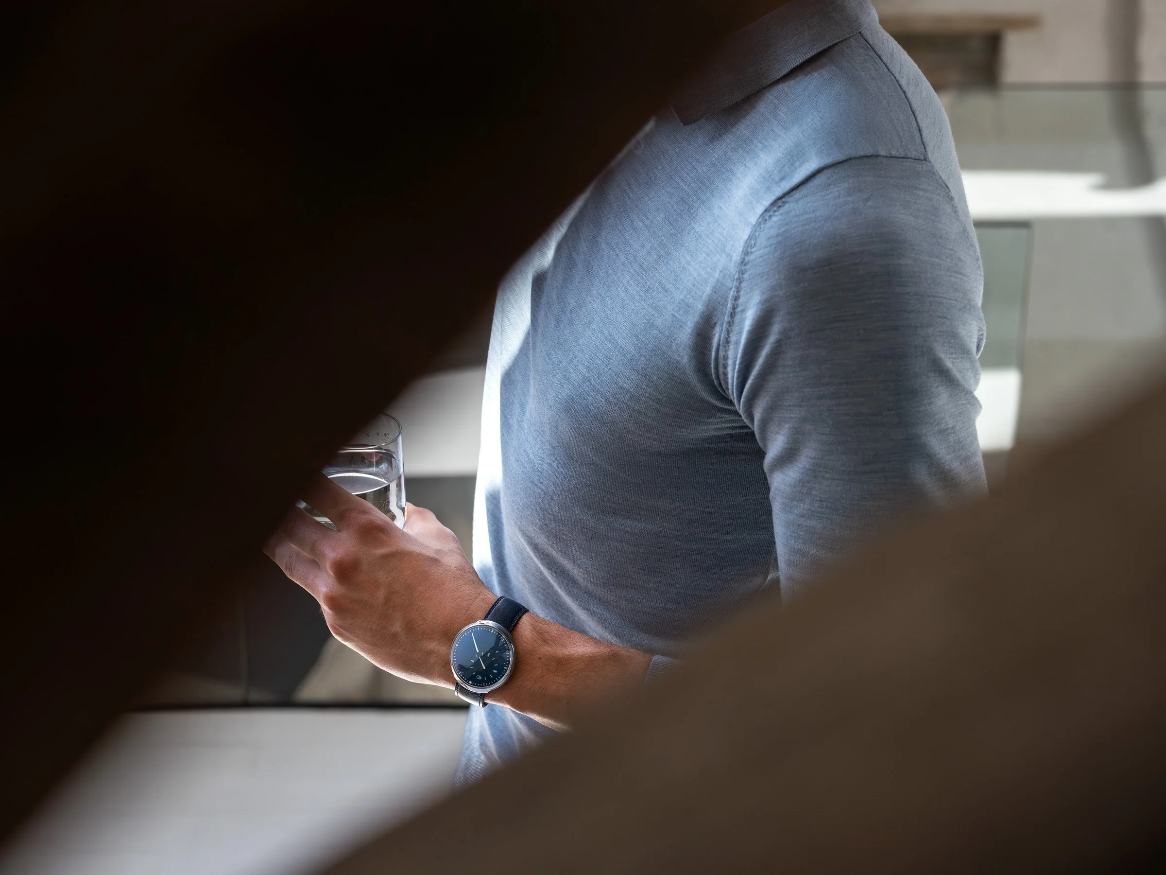
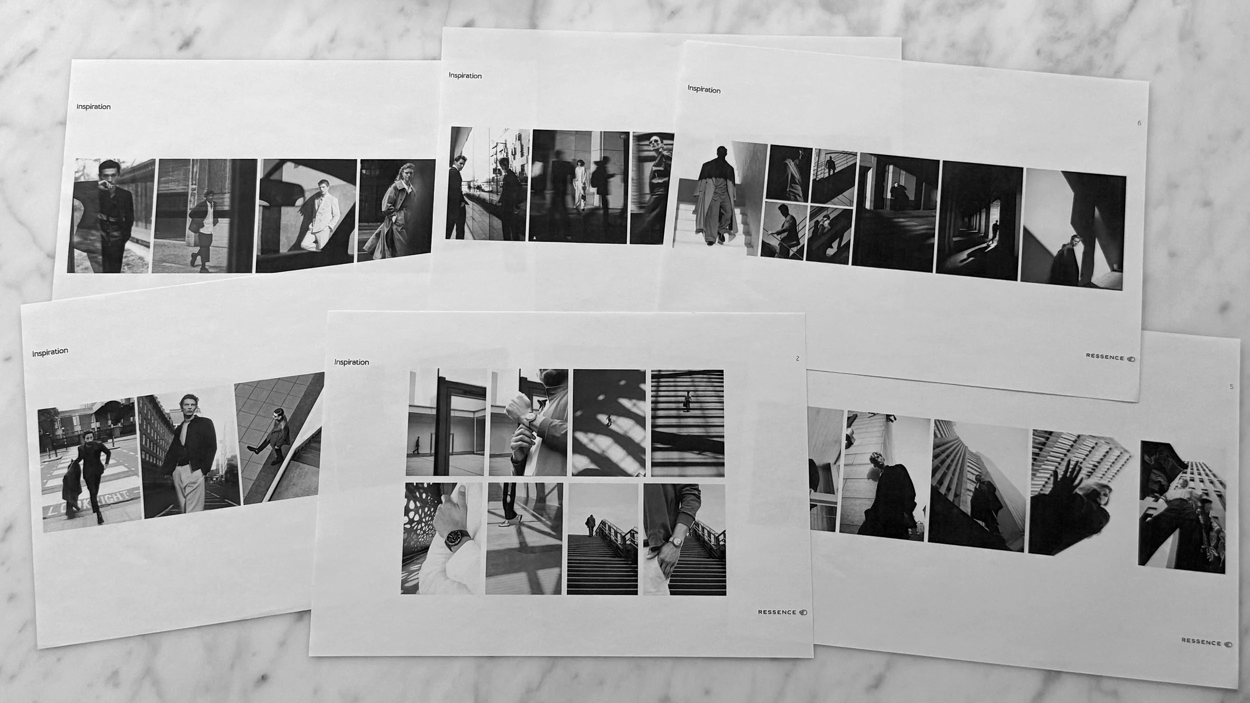
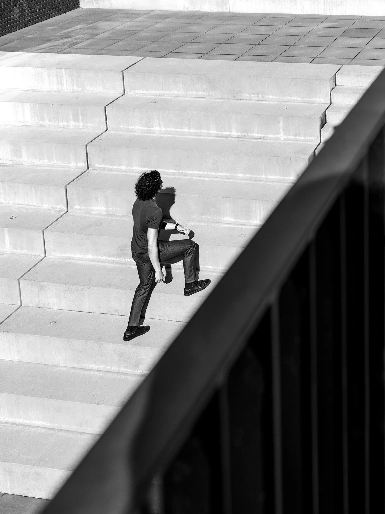
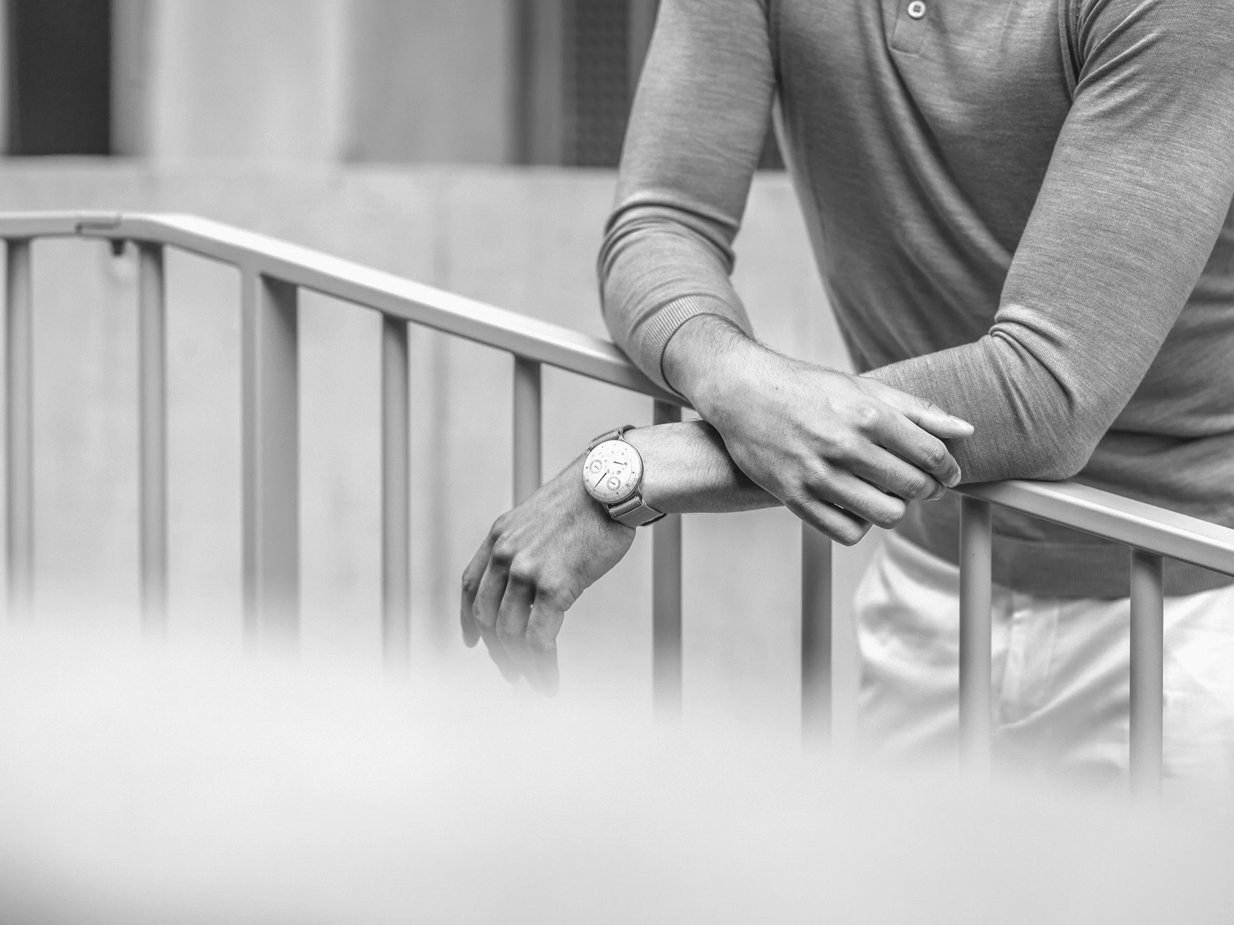
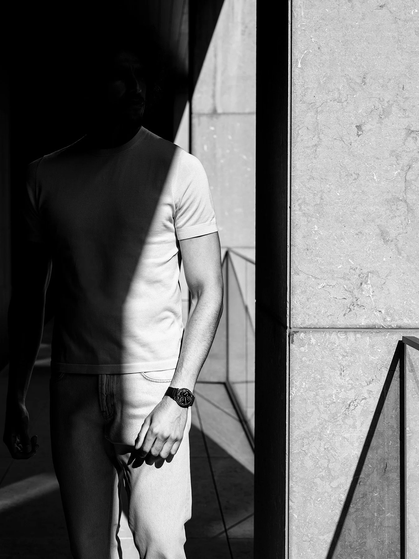
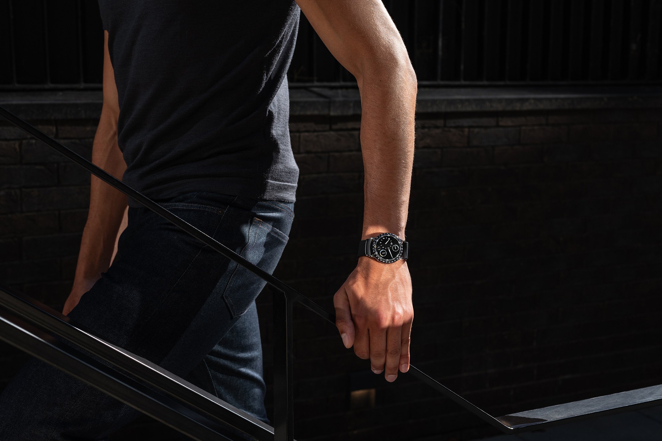
THE RESSENCE MAN
Silhouettes & Colours
-
We collaborated with Brand Director, Simon Hadjidimoff, to define the ‘Ressence Man’, detailing tones, textures, and cuts for future productions.
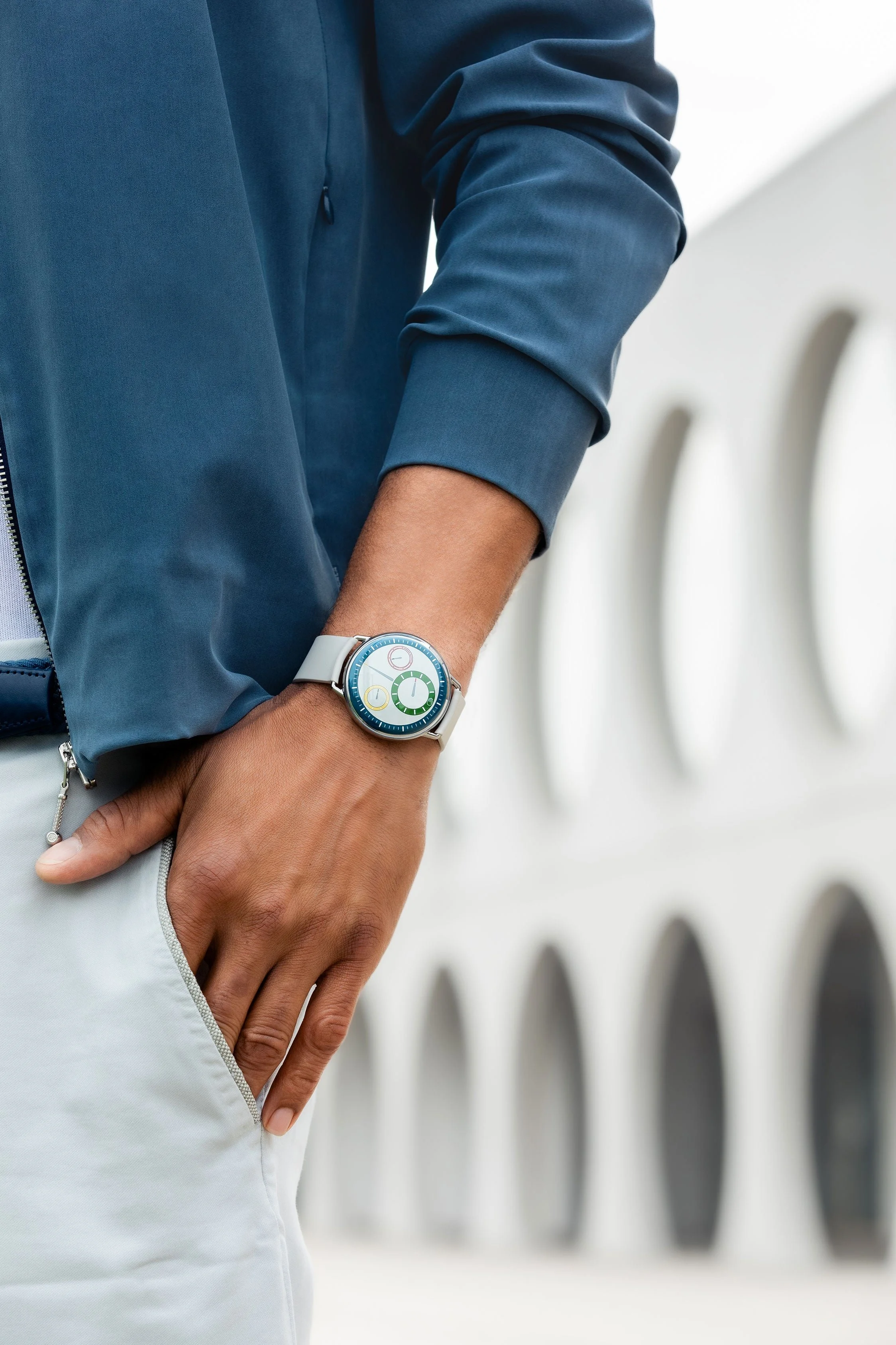
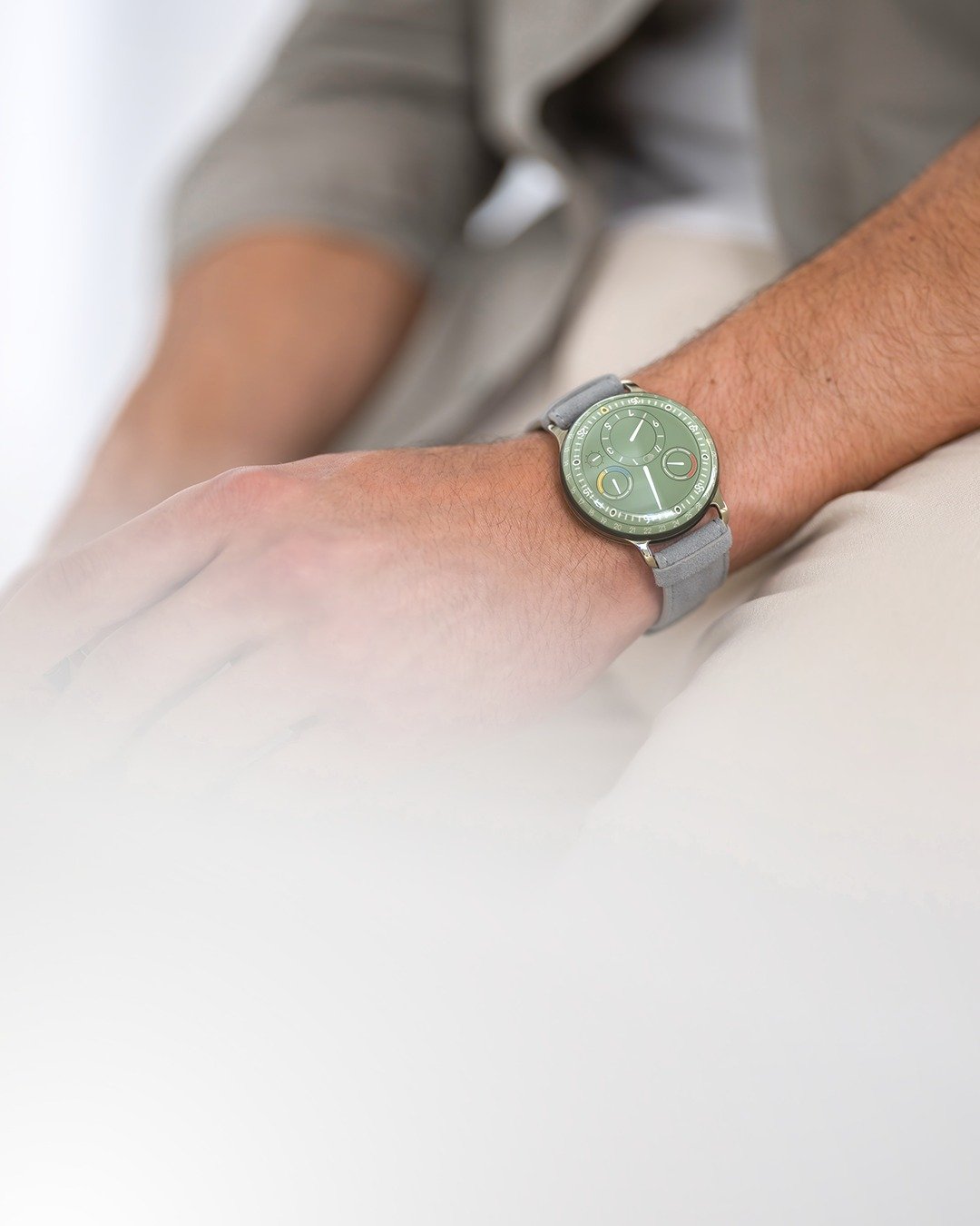

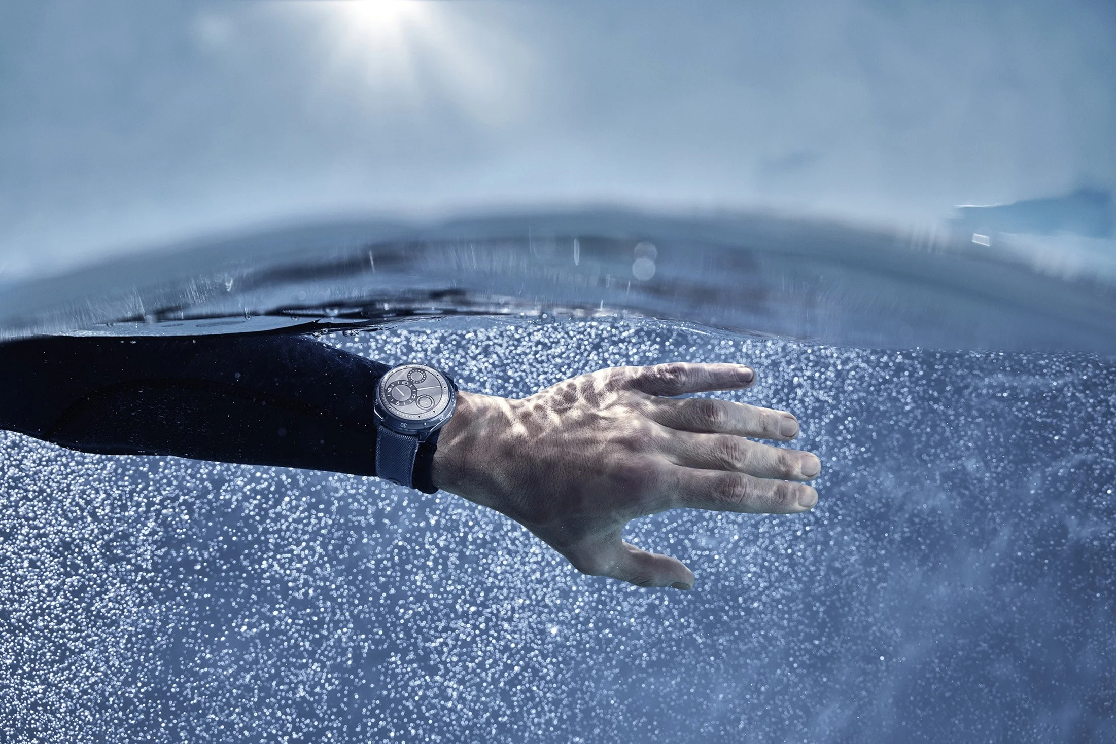
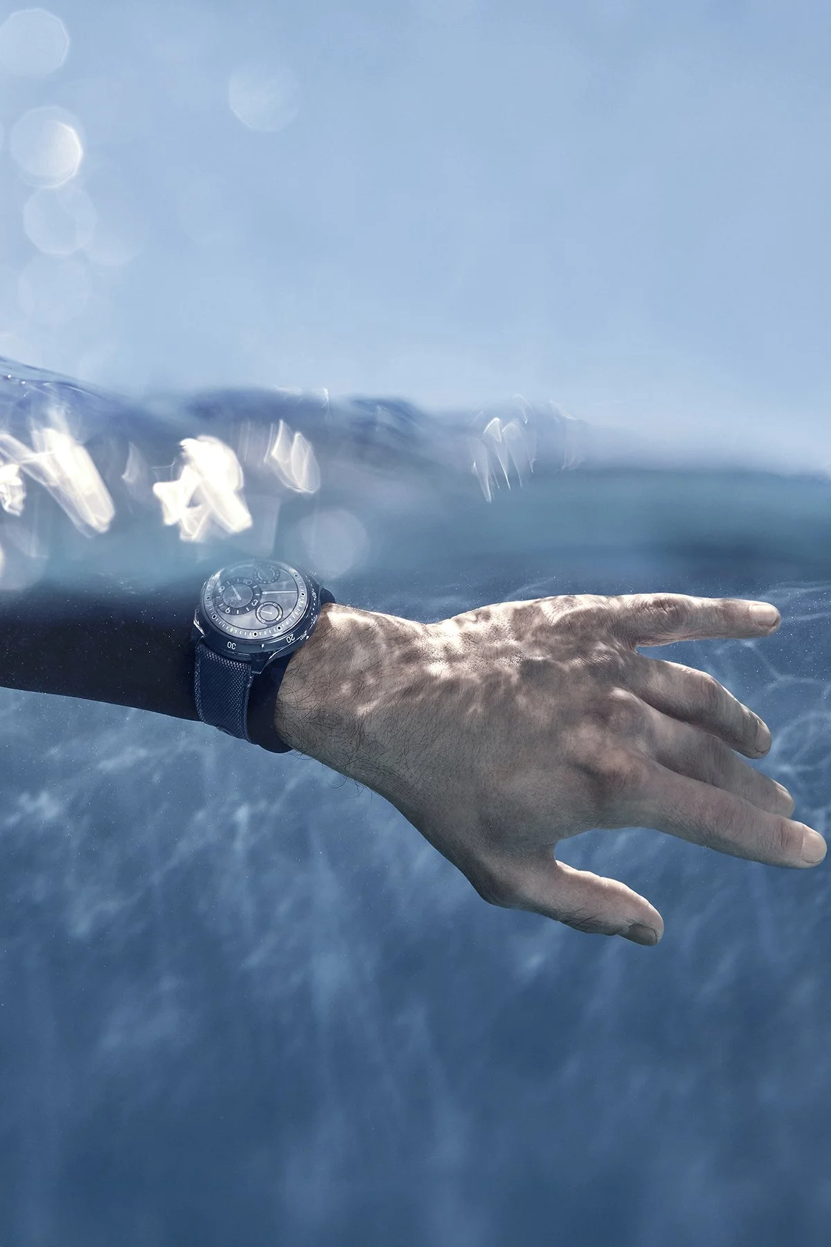
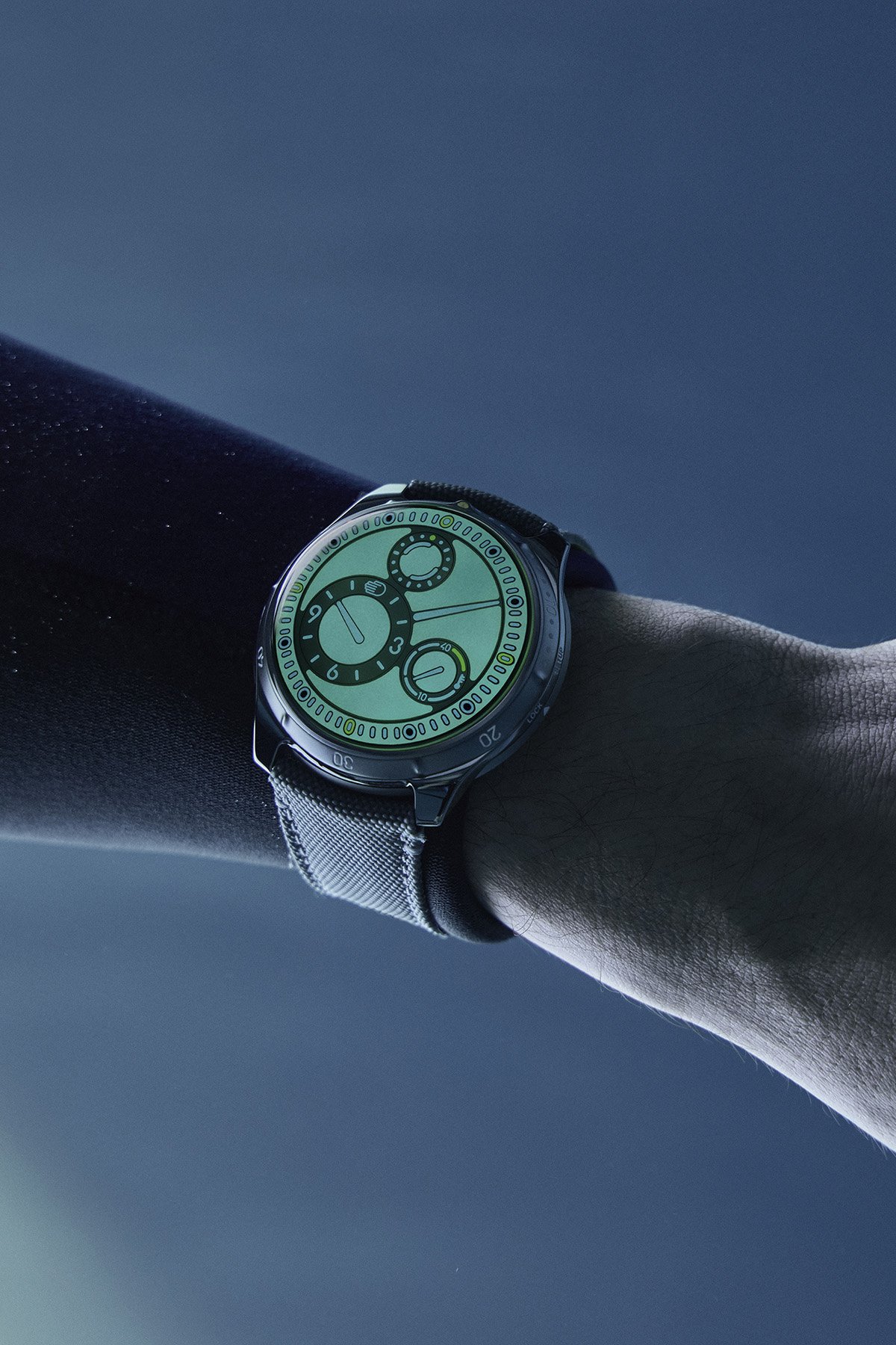
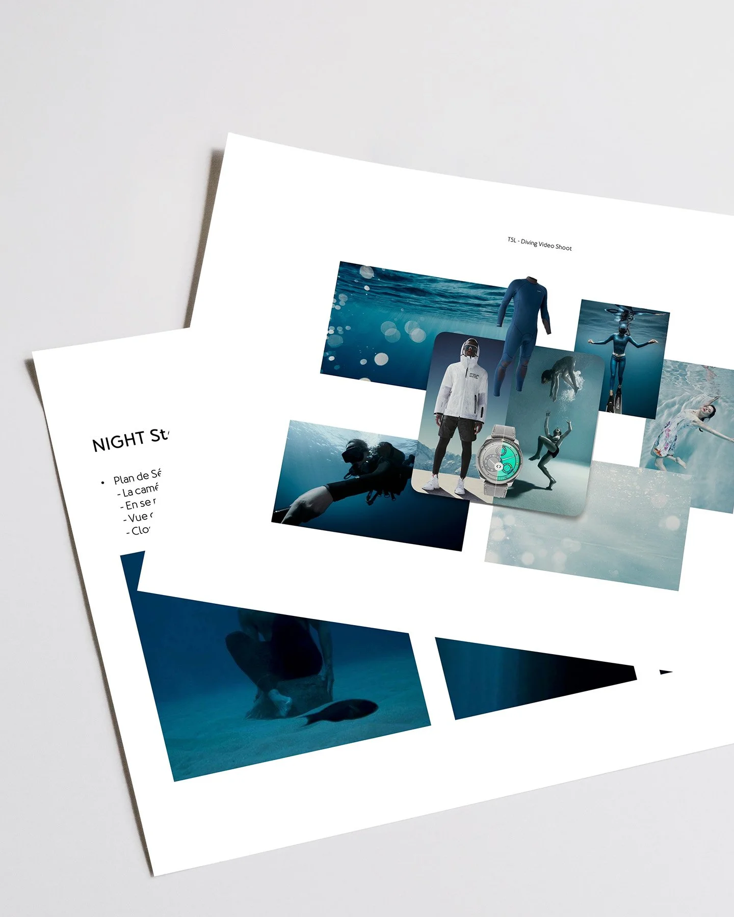
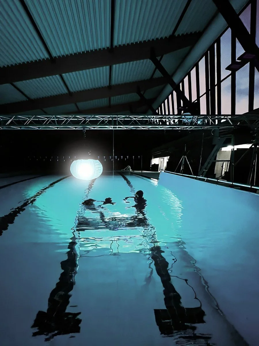
TYPE 5 L — TEASER & REVEAL
Encounter of the 5th type
Capturing of the only diver watch perfectly legible under water.
With its dual expression, one revealed in full daylight, the other in the twilight of the ocean depths, the watch called for a shoot capable of conveying both moods, in keeping with the brand’s minimal and essential style.
CREDITS
Creative Direction: Simon Hadjidimoff
Art Direction: Vaya Sigmas
Photo & Video: Harry Fayt
Video Editing: Claude Lee Sadik
Model: Sébastien Tassin
© Ressence 2024

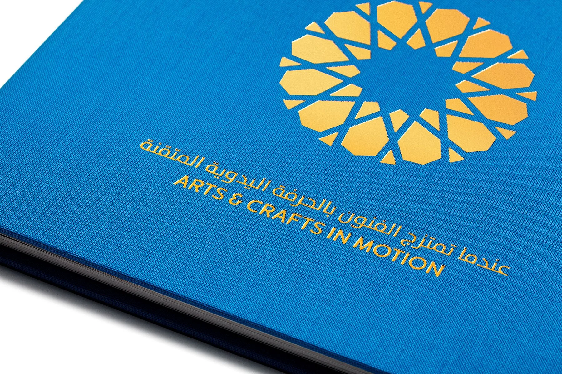
TYPE 1 DXB - DX2 - DX3
Arts & Crafts in Motion
-
We authored “Arts & Crafts in Motion: How Watchmaking Artistry and Arabic Art Converge”, a book to celebrate the DX trilogy with Dubai retailer Ahmed Seddiqi & Sons. The mission included founder interviews, research on Arab Geometric Art, visual curation, and coordination with co-editor, readers, book designers and translators.CREDITS
Author: Vaya Sigmas
Editors: Simon Hadjidimoff & Vaya Sigmas
Advance Readers: Benoît Mintiens, Shruti Dileep & Saif Ahmad
Book Design: Gringo’s Design
Arabic Translation: Plume Rouge
Print: GraphiusLimited edition of 200 copies
Published in 2023© Ressence 2023
TYPE 3 B / TYPE 3 W — CAMPAIGN
Rhapsody in Black & White
Like there is a “tic” and a “tac”, shadow and light, there is the TYPE 3 Black and the TYPE 3 White. Which precedes, and which follows? Charm and mystery together grow. Just as night gives way to day, and day fades into night, step into a dimension where contrasts meet in harmony.
CREDITS
Creative Direction: Vaya Sigmas & Simon Hadjidimoff
Photography: Thibault De Schepper
Videography: Claude Lee Sadik
Casting: Smiling Agency
Model: Gavin
© Ressence 2024

TYPE 3 B / TYPE 3 W — TEASER
Rhapsody in Black & White
Initiated to announce the relaunch of the TYPE 3 Black and TYPE 3 White, whose updates included the introduction of the brand’s in-house typeface, we commissioned Stoëmp Studio to produce a minimalist 2D motion design animation. Built around black-and-white graphic interpretations of the Ressence dial, the piece draws on the visual language of jazz and is set to a Hard-Bop tempo. A second animation was subsequently developed to highlight the brand’s typeface, this time introducing subtle touches of Ressence colours.
CREDITS
Creative Direction: Vaya Sigmas & Simon Hadjidimoff
Creative Partner: Stoëmp Studio
© Ressence 2024